So as you know, my artist is Devlin ft Yasmin -Runaway. The song is from the album 'Bud, Sweat & Beers' , his has different types genre for the album which include :
- Hip-Hop/Rap,
- Rap,
- Rock,
- Dance,
- and House
But the genre for this song in particular is Hip- Hop/Rap.
 |
| Runaway EP version |
This version of the artwork for the single is very simple, but direct to the point.
The album artwork also resembles the single, and is direct to the point, giving an insight to what the album is about.
Here are some more examples of artwork for digipaks:
 |
| Plan B- No good, sick to death (single) |
The front cover does not have an image of artist, and does not relate to the album title, but the drawing of various figures and the cup (with some form of hot drink) does have a certain appeal to his audience. The font which has the name of the artist also suits the genre.
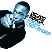 |
Dizzee Rascal -Fix Up Look Sharp
(single) |
This album is very simple (Just like Devlin's) but very effective. Dizzee Rascal achieves the rule of three, where the viewers eye instantly notices the artist. This is like the second interaction which builds a relationship between the audience ad the artist. The background is plain white, which makes no distraction for the attention to go straight to the artist. The font also represents what type of genre the album is and the font colour is also appropriate for the genre.
![So Alive [Skepta vs N-Dubz], N-Dubz](http://a3.mzstatic.com/us/r1000/054/Music/d3/26/64/mzi.hklgxwdi.170x170-75.jpg) |
Skepta vs N-Dubz
So Alive
(collaborating album) |
Skepta and N-Dubz are both well-known UK Hip-Hop / Rap artists, but have different persona's. For them to collaborate a whole album, keep their style original, fresh, separate (but still merge together) in both the songs and ancillary work is very hard for any artist, but they mastered it. The album cover as well as the whole digipak works well with both of the artists. On the front of the cover, you see the trademark font that N-Dubz always use, which shows continuity and the font used for Skepta's name is what is normally used in his album work. The flashing lighting on either side of the figure gives of the electric and hyped vibe that is in the songs for their album as well.


No comments:
Post a Comment