The Ancillary And Video Links
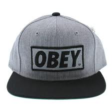
As you can see from above a fitted cap is a convention which is followed by Rap Artist which immediately links to the visual image of my character. Caps are seen by the public as urban wear and my artist wears one to connote his style and also to show like other rappers he is involved in wearing exclusive head wear. My particular artist wear an 'Obey' cap this an snap-back fitted cap which you can amend the size to your head shape. I wore this hat because it is a limited edition cap and is hard for anybody to get there hands on it so I felt it would appeal to the my target audience as they'll like my unique style.In my video the visual was also an urban look but I decided to go without the cap and have a fresh low 'Skinned fade' haircut which is also popular amongst rap artist as it shows their freshness and also a smarter side to the Genre which again appeals to another target audience who like change and is not expecting there favorite artist to have a predictable style. In both my main product and ancillary text you see my urban style wearing notable brands such as 'Ralph Lauren', 'Supremebeing' 'Prada' and 'LRG'.
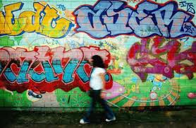
In my ancillary work the front cover you see the background a graffiti wall in a basketball court in a council estate in Hackney. I feel this visual clearly links to the hometown of my artist which is London and how he is representing the streets of London also giving the album and urban look to show my target audience where he is coming from. After looking at many options I felt the graffiti was the most effective as it shows a rebellious side to my artist as in some parts of London graffiti is banned. I also felt like this as graffiti is seen as a form of Art and a way for people to express their feelings and this is exactly what I wanted to do through my music, so the graffiti was an instant connotation to my feelings.
Visual Links and Artist Persona
The hand-sign visual was something I 100% wanted to create as I felt nobody else that was doing our genre would think to have a hand-sign personal to the artist. I felt the hand-sign I made for my artist was very unique as it has never been done before as you see above some example from current rappers. I feel the hand-sign I made will be recognizable across the globe and used by my fans for positive reason.
I feel it also helps my artist's visual for things like concerts as I may use this to pump up the crowd and they may respond to my music with this gesture which will be an amazing achievement as it is something personal.
The hand-sign I create is perfect from my genre as it creates a bull head which connotes being fearless which is how I'd like to see my artist portrayed. I'd like to think my artist is fearless as you see in my video and listen to the lyrics he shares a personal experience, which shows the public he is not afraid to share his life problems.
Successful Main and Ancillary Text ?
I feel both my Ancillary and Main text where successful as the both gave of the persona of an artist in the genre which was UK Rap. I feel in the video I portrayed my artist well with body language, posture, and mis en scene for example clothing. Again I felt my ancillary product was successful and will appeal to my target audience being young teens as when doing research I followed the conventions of previous UK Rap music album covers but also using my own unique twist to attract a wider audience. I felt both of my products gave an urban effect which is exactly what was needed for both my products.
Font
Finding the right font was difficult as there was so many to choose from on Photoshop it was essential I went through all of them to find the perfect font which created the visual effect I wanted. I want the font that I chose to connote a story and for it to tell a lot about the Artist. I then tested out a font called 'Stencil' and it had a big affect on my piece and had a great response from peers and teachers. As you can see above the font is in upper case letters, the design is very powerful as it looks as if all the letters have cracks in them. This immediately connotes my artist's mind frame as the upper case letters connote his strong character and the cracks represent the pain in his life and how nothing is perfect.
Target Audience


No comments:
Post a Comment