After being given a short tutorial to refresh our knowledge using the basics of Photoshop we were given a task to reproduce a Digipak that had errors.
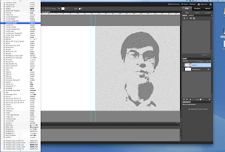
Because of the image we were given to use we had to think of a suitable genre which then gave us inspiration for a colour scheme and font type. Below is the front cover of the Digipak and a few screenshots
Above is the front cover of the Digipak I created
We were given an image to use although I wanted the image to fit the screen. As a result I had to crop the image to a square (it was a rectangle before) because, the digipak template is in a form of a square and I understand the importance of NOT stretching an image as is distorts the artists face/body. After doing so I decided I wanted my genre to be Indie. Indie digipaks usually have art and effects on images although they still remain very simple. Therefore I decided to use the stylise tab which allowed me to change the style of the image and as I wanted it to be very simple and plain I used a grey colour scheme throughout both panels.
Sometimes artists may not put their name or album title on the front of their digipaks and this is also mainly well-known Indie artists, who know their audience can easily identify with them.. sadly however this was not the situation for me. I added a very simple font in the colour white, and the artist name much larger than the album title because as an upcoming artist it is important that the audience notice who he is.
I applied the text and because the front cover of the digipak is mostly of his face I had to rotate the text because a big downfall of digipak's are placing text across the artists face


No comments:
Post a Comment