NO.1 -Student Advert
- It is the front cover of the digipak which allows the audience to familiarise themselves with it much more
- The student included an MP3 download which conveys that they understand the different forms of exchange and the introduction of new technology
- The information on the text is relevant
- HMV logo is up which allows the audience the to know where the digipak can be purchased

WEAKNESSES
- Too many font types which ruin the house style
- The texts look too spaced out
NO.2 - An established artist
STRENGTHS
- The main thing that I like about this advert is the way in which the artist is embedded into the animation, although his face does not seem as edited (apart from tone, brightness etc) therefore the audience are able to recognise the artist
- Like the front cover of the N-Dubz digipak the advert has a very 'urban' feel to it. The use of tall buildings signify that he is from a city. However the tall buildings may also represent estates and some of the more deprived areas where many rappers started an underground career.
- The difference between this advert and the student advert is that for the information of the album i.e. (when it is out/who it features) there is the same font although their is different styles for example the bold and the normal
- In order to gain audience interest the artist mentions features on the album which entices the audience to buy the album
- Like the student advert, the artist offers different forms of exchange such as buying it on a hard copy in stores such as HMV or being able to download it on softwares such as iTunes.
- The advert is similar to the digipak in terms of the house colour and the image used of him
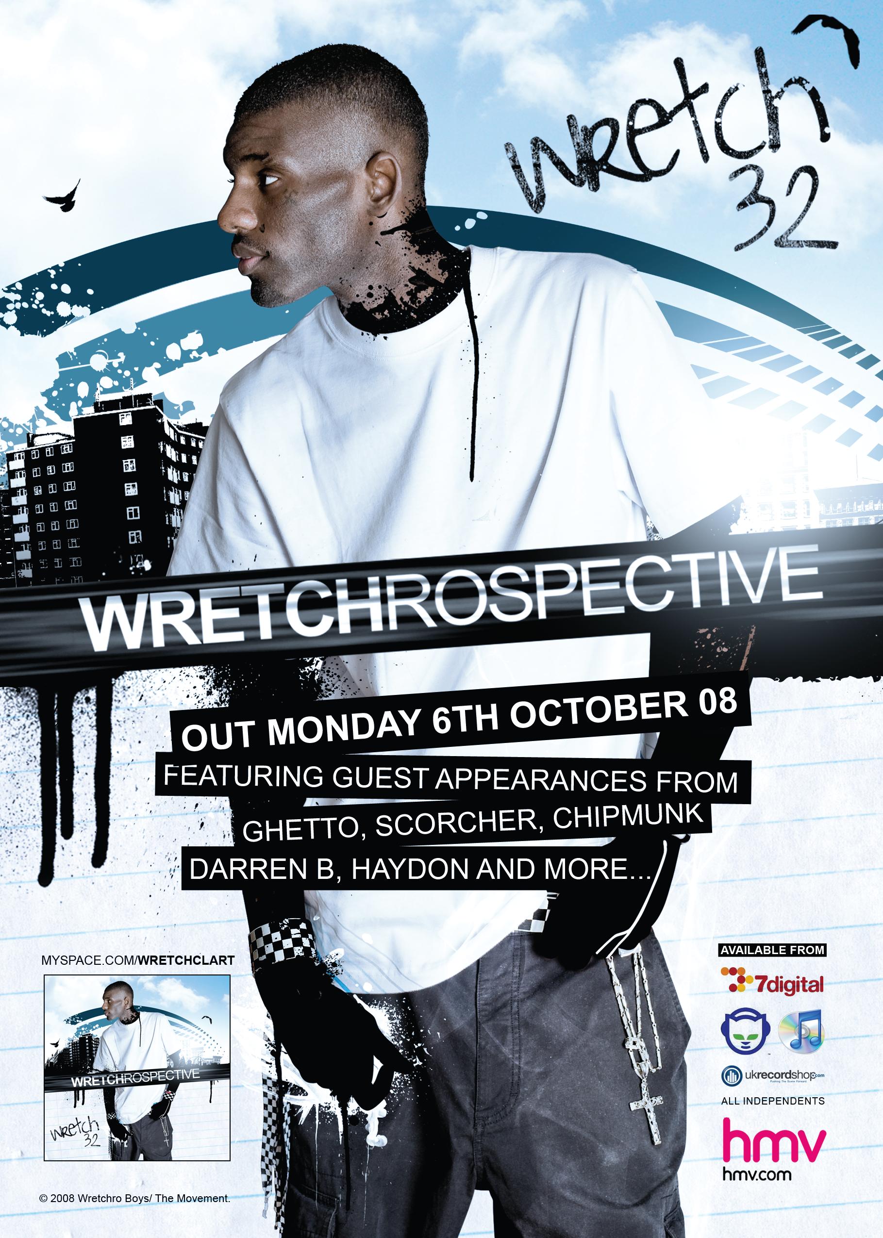
WEAKNESSES
- There is no sign of the record label
- There is no artist website shown or a logo to represent that he is on FaceBook or a social networking site such as Twitter which demeans audience interaction
NO.3 - An established artist
STRENGTHS
- There seems to be a clear theme on the advert and the album which is an olden day 60's/70's theme. This is represented through the artists attire as well as the font and colour scheme of the advert. The black is background is faded out in a way that suggests that it could appear on a 60's type newspaper or billboard.
- The mise en scene allows the audience to distinguish the theme clearly i.e the kind of microphone used.
- In order to understand what the advert is for there is also an image of the album so the audience can easily recognise the purpose of the advert
- the advert has a Motown and 60's style where much of his inspiration comes from, hence attracting a wider audience.

NO.2 - An established artist
STRENGTHS
- The main thing that I like about this advert is the way in which the artist is embedded into the animation, although his face does not seem as edited (apart from tone, brightness etc) therefore the audience are able to recognise the artist
- Like the front cover of the N-Dubz digipak the advert has a very 'urban' feel to it. The use of tall buildings signify that he is from a city. However the tall buildings may also represent estates and some of the more deprived areas where many rappers started an underground career.
- The difference between this advert and the student advert is that for the information of the album i.e. (when it is out/who it features) there is the same font although their is different styles for example the bold and the normal
- In order to gain audience interest the artist mentions features on the album which entices the audience to buy the album
- Like the student advert, the artist offers different forms of exchange such as buying it on a hard copy in stores such as HMV or being able to download it on softwares such as iTunes.
- The advert is similar to the digipak in terms of the house colour and the image used of him
WEAKNESSES
- There is no sign of the record label
- There is no artist website shown or a logo to represent that he is on FaceBook or a social networking site such as Twitter which demeans audience interaction
NO.3 - An established artist
STRENGTHS
- There seems to be a clear theme on the advert and the album which is an olden day 60's/70's theme. This is represented through the artists attire as well as the font and colour scheme of the advert. The black is background is faded out in a way that suggests that it could appear on a 60's type newspaper or billboard.
- The mise en scene allows the audience to distinguish the theme clearly i.e the kind of microphone used.
- In order to understand what the advert is for there is also an image of the album so the audience can easily recognise the purpose of the advert
- the advert has a Motown and 60's style where much of his inspiration comes from, hence attracting a wider audience.

WEAKNESSES
- There is no album release date
- No logos to represent where you can buy the album or a FaceBook link etc.
- The advert only tells you about how good the album there is not so much information on how to purchase it and when it is coming out
No comments:
Post a Comment