Thursday, 22 December 2011
Thursday, 15 December 2011
Planning : Shortlist of fonts, colours, layouts and etc
For the font of my digipak and advertisement, i will use a one simple plain font because i plan to make it simple yet very effective. So whilst looking for fonts on photoshop elements, i came across one which is like the font 'Times New Roman's . The colour of the font will be white as i plan to use a brick background for my digipak and a black background for my advert. So the colour white will stand out and be easy to read for viewers.
I also have an idea which is to fill the inside panels in the same brick background as the font and back of the digipak; and on the left panel have a shadow outline of my artist. By doing this, it will represent that my artist is representing an urban background, his music is influence by the streets .
For my digipak and inside panels, the colour in background is not solid. It is a brick background and will be shown with a sepia edge. By doing this, i will use the image + adjustment tool from Photoshop elements to change the contrast and etc. For my advertisement, i am using solid black because I want a basic style.
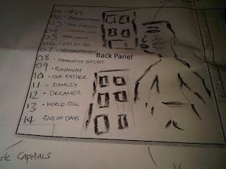
For the layout of my digipak, i will use a very 'traditional' style of the digipak style and it will be structured very clearly. The track list will be on the right-hand side of the back cover of the digipak .
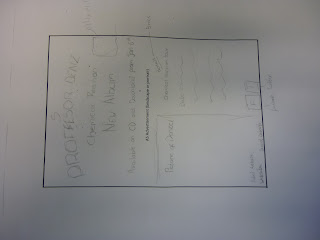
The layout for my advertisement it will be landscape and the album cover will be placed on the left-hand, information will be situated on the right and the artist information will be at the bottom. As i have said before, the background will be black and the writing will be in white. Plain and simple yet effective.
PLANNING: Shortlist of photos
I chose portrait shots because for my digipak front cover i am using half of his face and I want his facial expression to be straight. In terms of his appearance as he is a rap artist i wanted to follow the stereotypical conventions so he kept his earrings in to represent 'bling'. Furthermore throughout the music video he is seen in a Ralph Lauren shirt and although it is very plain it is a designer label which many rap artists tend to wear yet it is very simple and he is a walking advert for Ralph Lauren (just kidding but yeah)
PLANNING: Brief overview of the Do's and don'ts of design work
DO
- clear font
- appropriate sizes for image and font
- clear photo's that are in focus
- a layout that follows the rule of thirds for composition
- an appropriate type face that follow:
+ genre convention
+ be clear from a distance
- use the 3 colour rule that is appropriate for
+ images
+ font
+ background
- think carefully about how you integrate
+ font
+ text & language
+ image
- use appropriate industry logos and conventions properly positioned
+ barcode
+ date
+ copyright
+ titles
+ artist name
DON'T
- Stretch images
- Do not place texts across their face
- Use a font simply because you like it
- Do not use a layer style
- Do not feel you need a separate photo on each panel
PLANNING: Graffiti font ideas
As there are different types of graffiti fonts that people use/do I have made a shortlist of potential fonts I will used found on dafont.com. in my opinion different types of graffiti fonts may symbolize different things. Graffiti is something that has been around for years and has society changes so does urbanisation and I personally think that 2nd font ma be much ore urban compared to the first font.
PLANNING: Short list of fonts, colours, layouts and design ideas
FONTS:
i decided to use plain fonts for my artist name and album title because, despite the effect on the artist's image the rest of the front cover is very simple and i plan to use a simple digipak which has a lot of meanings. I used a white colour font because it contrasts the black. This font and colour will also be used for the back of my digipak. Below is an example of the font that i will use called 'Baskerville'
i decided to use plain fonts for my artist name and album title because, despite the effect on the artist's image the rest of the front cover is very simple and i plan to use a simple digipak which has a lot of meanings. I used a white colour font because it contrasts the black. This font and colour will also be used for the back of my digipak. Below is an example of the font that i will use called 'Baskerville'
My initial idea was to have the whole of the inside panels in a brick background and on the left panel have graffiti saying 'Professor'. By using graffiti and a brick wall background will represent that my artist is street and as his genre is grime/hp hop and rap the use of graffiti will reflect the sense of being urban.
COLOURS
The colours i have decided to use are strictly black and white for the front and back cover of my digipak because I want a basic house style, however the inside panel font colours will be black in order to compliment the brick walls.
LAYOUT
The layout of my digipak will be structured very clearly the track list will be in the centre of the back cover of the digipak however, if i decide to use a background image (which will be black and white) it will more than likely be on the left side or aligned on the bottom center. in terms of the layout for my advertisement it will firstly be landscape. This is because i want the background of my advertisement to be brick walls which will link the digipak to the advert making the audience familiarise themselves with the album. Furthermore the fonts used for my advert and the front cover of my digipak will be placed in a way that makes them seem as they are also graffiti and placed onto a brick wall. If this idea does not work i will stick to a white background, landscape with the front cover of my digipak on the left hand side, the information about the album release date, forms of exchange etc on the right hand side and logos of social network sites at the bottom.
Shortlist of Photos that will be used for my digipak
I took these photos of Denzel in our college photography studio.
Wednesday, 14 December 2011
Influences
Here are a few digipaks that have inspired me to make my own digipak
When i first saw these two album covers, the thing that grabbed me first was the power in the eyes . I would want my artist to look just like this (face directly looking into the camera) showing either 'no emotion' or 'little'
This is not for the album cover but i would want this to be either on one of the inside panels of on the back. Maybe have the outline just showing or have the photo of the artist in colour
From Devlin's very own album which has this the song 'runaway' whic we had done for our music video. I want to use a brick background for the background but it wont have the normal colour. In photoshop, i'll play about with the contrast's and lighting to get a dull-sepia look.
Tuesday, 13 December 2011
First Attempt At Album Cover
Problems:
- The colours/ Tones dont match
- The two blues (font and background) dont match
- the image was not taken by me i got it from google apparently we cant do that
Pros:
- I like the opacity of the picture of denzel it makes the shot seem more dreamlike it didn't work too well with that background though.
- The framing was good i didn't stretch the image and make his head look disproportionate.
What i need to do now is
- Create my own original background
- choose a better matching color scheme
(Some Screengrabs of the creative process)
Catch up Shazray
You are falling behind in your blogging and your ancillary work Shazray - catch up fast over the holidays - your work has been good so far so dont lose it at this late stage! Use workshop to make up for missed lessons
Monday, 12 December 2011
Do's and Don'ts
These are the Do's and Dont's for the construction of our digipak covers and magazine adverts
DO's:
DO's:
- Use clear font
- Use appropriate sizes for images and font
- Use clear photos that are in focus
- Use photos that are the right shape for the page
- Use a layout that follows the rule of thirds
- Be careful where you place the font
- Follow the conventions of the three colour rule and use colour that is appropriate
- Use appropriate industry logos and conventions, properly positioned
- Stretch image, this will make them out of focus
- Use layer styles
- Use unnecessary effects. All effects MUST suit genre
- Place text across artists face
- Use a font simply because 'you like it'
- Feel you need a separate photo on every panel- be creative!!!
Sunday, 11 December 2011
RESEARCH: Inspiration
When researching digipak's I came across many artistic digipak's which consisted of animations, drawings and some cartoon effects. However after doing deeper research into the artists and genre I realised that they were from the Indie genre, which is the complete opposite to my artist's genre. I was still influenced by the simplicity of the Indie digipak's so I decided that I wanted to go for a simple digipak with limited effects yet still allowing to audience to familiarise themselves with the artist and the genre. Below are a few Hip Hop digipak's that I found that were either simple, artistic or I just generally found interesting.
RESEARCH: Analysis of magazine advertisements that relate to your genre
NO.1 -Student Advert
- It is the front cover of the digipak which allows the audience to familiarise themselves with it much more
- The student included an MP3 download which conveys that they understand the different forms of exchange and the introduction of new technology
- The information on the text is relevant
- HMV logo is up which allows the audience the to know where the digipak can be purchased
- Competitions are available which promote and market the album/artist much more as it is a clear form of audience interaction and competitions and promotions usually cause viral marketing
WEAKNESSES
- Too many font types which ruin the house style
WEAKNESSES
- Too many font types which ruin the house style
- The texts look too spaced out
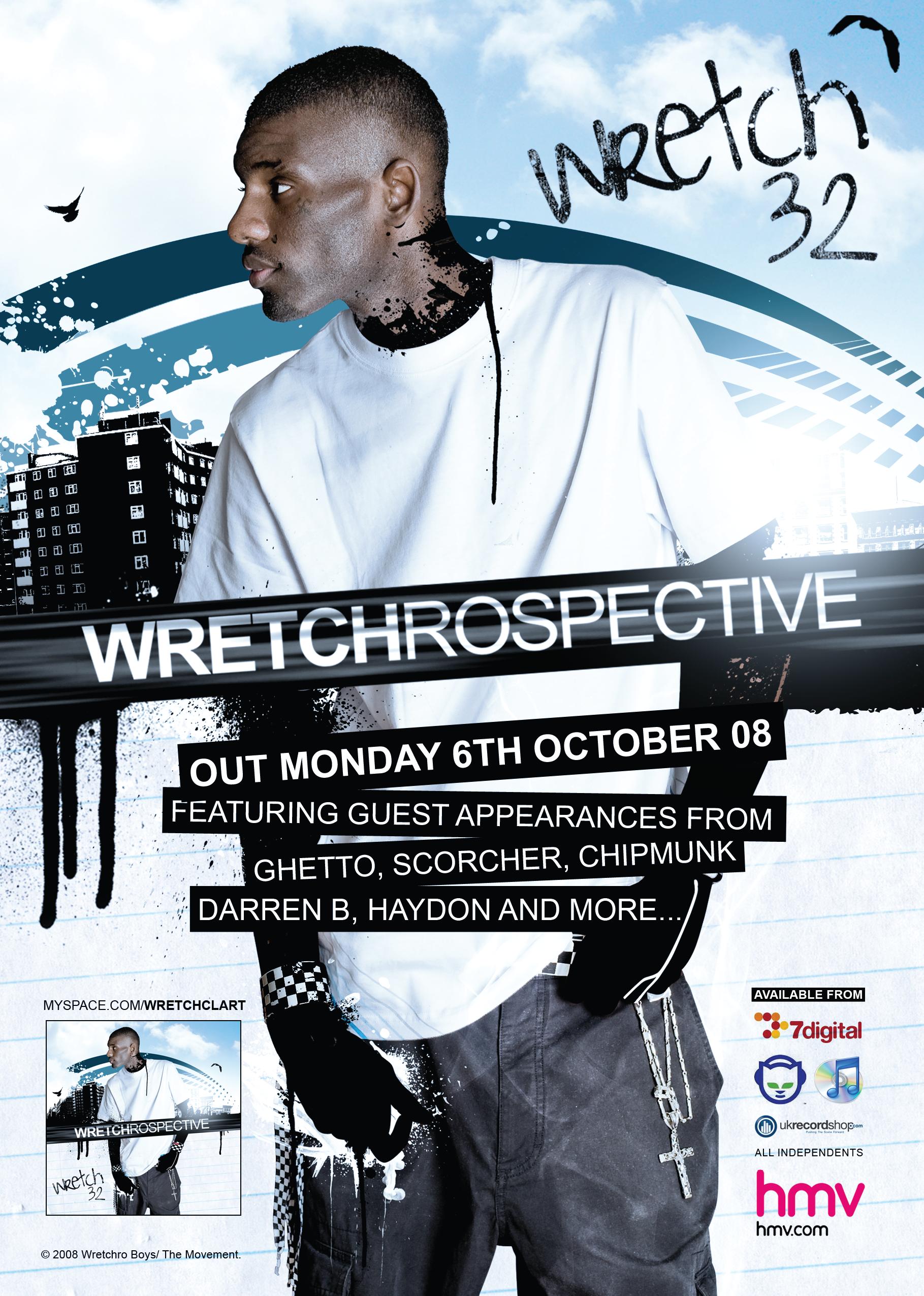
NO.2 - An established artist
STRENGTHS
- The main thing that I like about this advert is the way in which the artist is embedded into the animation, although his face does not seem as edited (apart from tone, brightness etc) therefore the audience are able to recognise the artist
- Like the front cover of the N-Dubz digipak the advert has a very 'urban' feel to it. The use of tall buildings signify that he is from a city. However the tall buildings may also represent estates and some of the more deprived areas where many rappers started an underground career.
- The difference between this advert and the student advert is that for the information of the album i.e. (when it is out/who it features) there is the same font although their is different styles for example the bold and the normal
- In order to gain audience interest the artist mentions features on the album which entices the audience to buy the album
- Like the student advert, the artist offers different forms of exchange such as buying it on a hard copy in stores such as HMV or being able to download it on softwares such as iTunes.
- The advert is similar to the digipak in terms of the house colour and the image used of him

WEAKNESSES
- There is no sign of the record label
- There is no artist website shown or a logo to represent that he is on FaceBook or a social networking site such as Twitter which demeans audience interaction
NO.3 - An established artist
STRENGTHS
- There seems to be a clear theme on the advert and the album which is an olden day 60's/70's theme. This is represented through the artists attire as well as the font and colour scheme of the advert. The black is background is faded out in a way that suggests that it could appear on a 60's type newspaper or billboard.
- The mise en scene allows the audience to distinguish the theme clearly i.e the kind of microphone used.
- In order to understand what the advert is for there is also an image of the album so the audience can easily recognise the purpose of the advert
- the advert has a Motown and 60's style where much of his inspiration comes from, hence attracting a wider audience.
NO.2 - An established artist
STRENGTHS
- The main thing that I like about this advert is the way in which the artist is embedded into the animation, although his face does not seem as edited (apart from tone, brightness etc) therefore the audience are able to recognise the artist
- Like the front cover of the N-Dubz digipak the advert has a very 'urban' feel to it. The use of tall buildings signify that he is from a city. However the tall buildings may also represent estates and some of the more deprived areas where many rappers started an underground career.
- The difference between this advert and the student advert is that for the information of the album i.e. (when it is out/who it features) there is the same font although their is different styles for example the bold and the normal
- In order to gain audience interest the artist mentions features on the album which entices the audience to buy the album
- Like the student advert, the artist offers different forms of exchange such as buying it on a hard copy in stores such as HMV or being able to download it on softwares such as iTunes.
- The advert is similar to the digipak in terms of the house colour and the image used of him

WEAKNESSES
- There is no sign of the record label
- There is no artist website shown or a logo to represent that he is on FaceBook or a social networking site such as Twitter which demeans audience interaction
NO.3 - An established artist
STRENGTHS
- There seems to be a clear theme on the advert and the album which is an olden day 60's/70's theme. This is represented through the artists attire as well as the font and colour scheme of the advert. The black is background is faded out in a way that suggests that it could appear on a 60's type newspaper or billboard.
- The mise en scene allows the audience to distinguish the theme clearly i.e the kind of microphone used.
- In order to understand what the advert is for there is also an image of the album so the audience can easily recognise the purpose of the advert
- the advert has a Motown and 60's style where much of his inspiration comes from, hence attracting a wider audience.
WEAKNESSES
- There is no album release date
- No logos to represent where you can buy the album or a FaceBook link etc.
- The advert only tells you about how good the album there is not so much information on how to purchase it and when it is coming out
RESEARCH: Analysis of artist digipaks that relate to your genre
 N-Dubz 'Love Live Life' is a very good example of a digipak that relates to my genre of UK R&B/Grime because , it features all the key conventions of an R&B digipak. Firstly the title of the artists name is in a graffiti font, which automatically suggests that their is an element of grime/rap in the group. The background image of a city with landscape buildings also emphasise the stereotypical conventions of UK rap however, N-Dubz also make this evident in some of their music videos which feature both city landscapes as well as estates and blocks. In terms of mise en scene the gestures of the two male artists suggests that they are showing of their 'bling' (jewellery) which connotes the idea that they are rappers as this is also a stereotype of the conventional rapper. The female singer is in the middle and whilst the males are wearing black shirts she is in a white dress which makes her stand out. Although her body parts are not amplified, the use of a fan may suggest that there is some elements of voyeurism in her hair blowing. The use of editing is very effective within the digipak cover the use of studio lighting and enhanced tones and brightness creates a loud and vibrant cover which is also enhanced through different colour spotlights and is emphasised with a palm tree which creates a relaxed and party vibe. This also connotes the title of the album which is 'Love Live Life'.
 Thursday, 8 December 2011
Pitch for Digi Pak and Advertisment
Today i presented both my digipak and advert to my teacher and she was pleased with the ideas that i had and thought they were effective and with a few changes, i can start to make the digi pak and adverton photoshop.
The changes were:
The changes were:
- Instead of using graffiti fonts, keep it simple and try using fonts from photoshop elements
- Change the way you have positioned the 'D' for the artist title and also the name of the album (dont stick it on the edge at the bottom, raised in just a little bit.
- You have forgotten to write the copyright / company / added the record label and etc on both the advert and digipak !!
- 'Out Now' should be a little bigger than the information that is there
Wednesday, 7 December 2011
Screening at the cinema .... Feedback !!!
So the day has come, i was happy with everyone's reaction to the screening inside the cinema. When i came to getting feedback from people, my pencil was broken :( ...
... but i had enough battery on my blackberry so i filmed people instead ! :)
Here we have Rosetta, who is in my class and had seen our group working very hard on our music video through production and editing, and this was her first time watching the music video: take a look at what she had to say
Here we have Jem, he is also a media student from my college, was not in my class and had NO idea what to expect :
Now for my good friend Prince who belonged to a group that had a completely different genre and approach to making their own music video
DO's And Donts
Do's
- Use a clear font
- Use appropriate sizes for: Images, font
- Use clear photos that are in focus
- Use photos that are appropriate shape for the page
- Use a layout that follows the rule of thirds for composition
- Use an appropriate type face that follows:
- Be careful where you place the font. follow genre conventions and be clear from a distance
- Follow the conventions of the 3 colour rule and use colour that is appropriate for:
- Images
- Font
- Background
- Use appropriate industry logos abd conventions, properly positioned:
- Barcode
- Date
- Copyright
- Titles
- Artist name
DONT
- Stretch images, this will make them out of focus
- Use layer styles
- Use unnecessary effects. Any effects used Must suit the genre
- Place text across the artists face
- Use a font simply because you 'like it'
- Feel you need a separate photo on every panel-Be creative
Image of artists:
- consistence Visual style, font cover and colour scheme
Overall Digipak style:
- Uses 3-4
- No More that 2 different fonts;
- Includes element of graphic designer
- Not simply images lifted from the video
- Must create some sort of visual link with advertisement
Subscribe to:
Comments (Atom)


